Colour as an Integral Part of Design
Colours help define how design is experienced in a space. At Stelton, they are therefore not chosen as a finishing detail, but developed as an integrated part of the overall design.
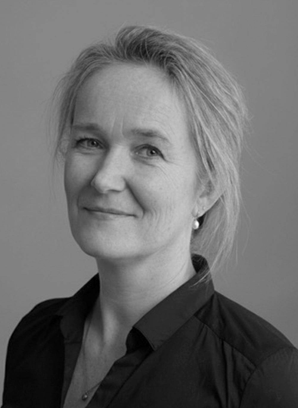
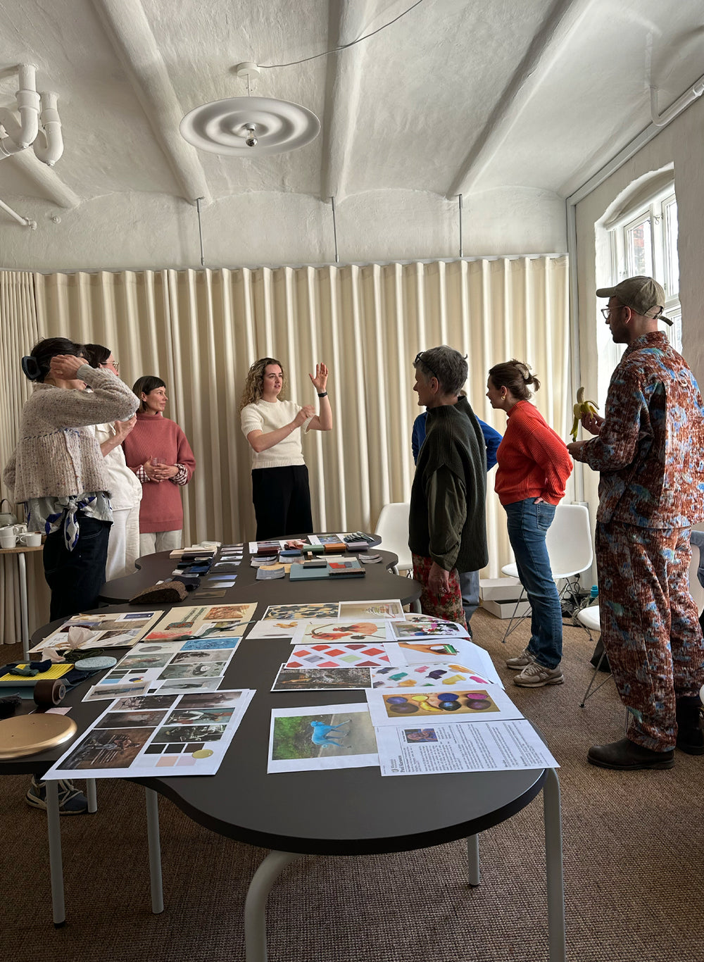
Creative Manager Anne Marie Raaschou-Nielsen leads the work with colours at Stelton. Drawing inspiration from architecture, art, design and cultural movements, she works with colours as something that should both feel relevant to the present and remain meaningful for many years to come.
Twice a year, new colour palettes are developed for the assortment. Each nuance is carefully selected and becomes part of a balanced whole where form, material and atmosphere must work together.
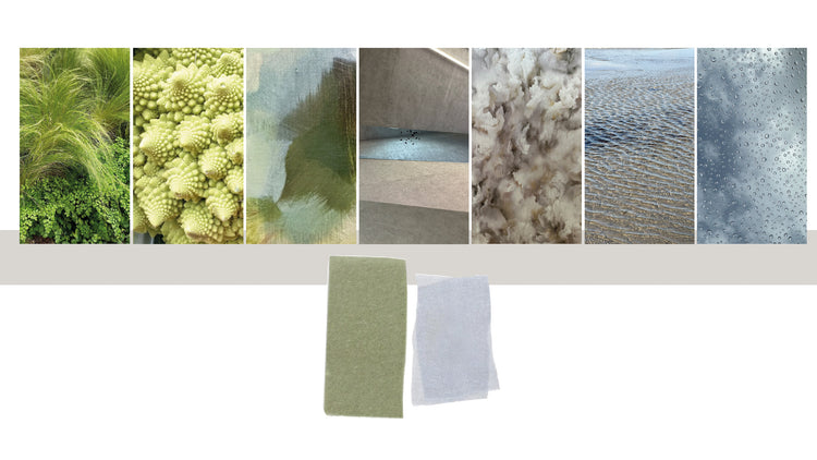
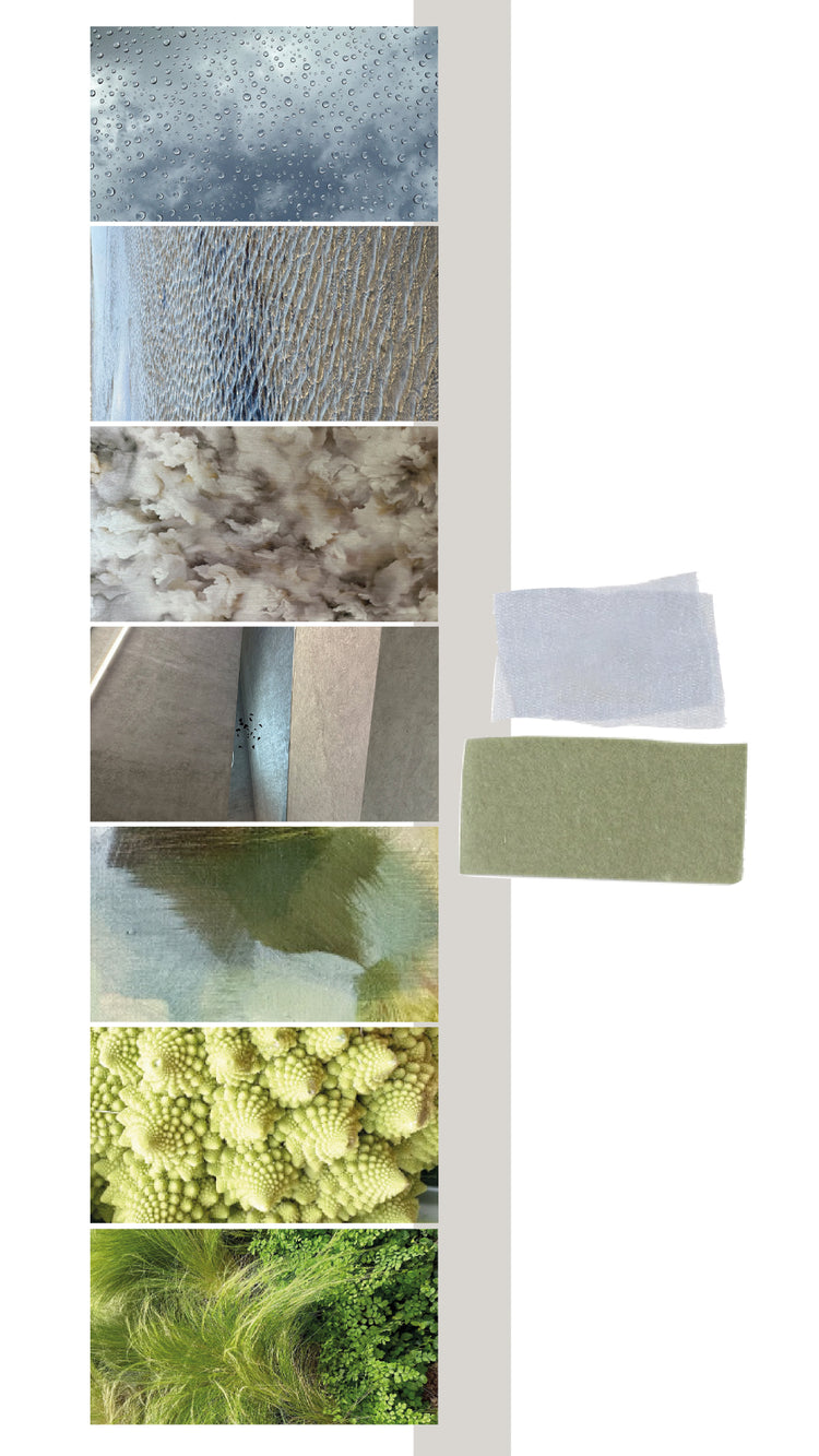
“Inspiration comes from nature’s quiet moments — dew on leaves, the sky after rain and the first green shoots emerging in spring.”
– Anne Marie Raaschou-Nielsen
Colour Forecasting in an International Context
Part of the process takes place in dialogue with other colour specialists. As Chair of the Danish Color Board, Anne Marie is part of a Danish network of colour experts who analyse and develop upcoming colour trends. The results are then brought to Intercolor — an international collaboration between colour experts from 18 countries. Here, representatives from fields such as design, fashion and interiors meet several times a year to present their national colour forecasts and discuss the colours expected to shape the coming seasons globally.
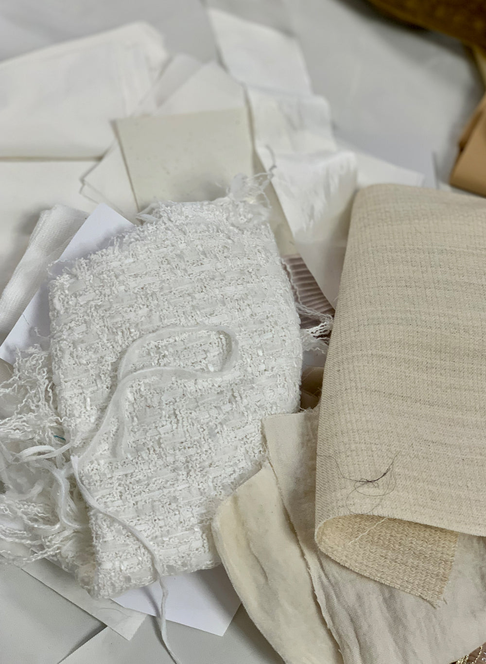
Soft Fern Green, Soft Cloud & Soft Sand
The colour palette for Spring/Summer 2026 stems from a desire for calm, lightness and balance. The inspiration is drawn from quiet moments in nature — dew on leaves, the sky after rain and the first green shoots emerging in spring. The result is three harmonious shades: Soft Fern Green, Soft Cloud and Soft Sand.